
I’m very pleased to announce ggplot2 2.2.0. It includes four major new features:
-
Subtitles and captions.
-
A large rewrite of the facetting system.
-
Improved theme options.
-
Better stacking.
It also includes as numerous bug fixes and minor improvements, as described in the release notes .
The majority of this work was carried out by Thomas Pederson , who I was lucky to have as my “ggplot2 intern” this summer. Make sure to check out his other visualisation packages: ggraph , ggforce , and tweenr .
Install ggplot2 with:
install.packages("ggplot2")Subtitles and captions#
Thanks to Bob Rudis , you can now add subtitles and captions to your plots:
ggplot(mpg, aes(displ, hwy)) +
  geom_point(aes(color = class)) +
  geom_smooth(se = FALSE, method = "loess") +
  labs(
    title = "Fuel efficiency generally decreases with engine size",
    subtitle = "Two seaters (sports cars) are an exception because of their light weight",
    caption = "Data from fueleconomy.gov"
  )
These are controlled by the theme settings plot.subtitle and plot.caption.
The plot title is now aligned to the left by default. To return to the previous centered alignment, use theme(plot.title = element_text(hjust = 0.5)).
Facets#
The facet and layout implementation has been moved to ggproto and received a large rewrite and refactoring. This will allow others to create their own facetting systems, as descrbied in the vignette("extending-ggplot2"). Along with the rewrite a number of features and improvements has been added, most notably:
- ou can now use functions in facetting formulas, thanks to Dan Ruderman .
ggplot(diamonds, aes(carat, price)) +
  geom_hex(bins = 20) +
  facet_wrap(~cut_number(depth, 6))
- Axes are now drawn under the panels in
facet_wrap()when the rentangle is not completely filled.
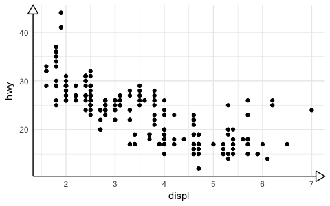
ggplot(mpg, aes(displ, hwy)) +
  geom_point() +
  facet_wrap(~class)
- You can set the position of the axes with the
positionargument.
ggplot(mpg, aes(displ, hwy)) +
  geom_point() +
  scale_x_continuous(position = "top") +
  scale_y_continuous(position = "right")
- You can display a secondary axis that is a one-to-one transformation of the primary axis with
sec.axis.
ggplot(mpg, aes(displ, hwy)) +
  geom_point() +
  scale_y_continuous(
    "mpg (US)",
    sec.axis = sec_axis(~ . * 1.20, name = "mpg (UK)")
)- Strips can be placed on any side, and the placement with respect to axes can be controlled with the
strip.placementtheme option.
ggplot(mpg, aes(displ, hwy)) +
  geom_point() +
  facet_wrap(~ drv, strip.position = "bottom") +
  theme(
    strip.placement = "outside",
    strip.background = element_blank(),
    strip.text = element_text(face = "bold")
  ) +
  xlab(NULL)
Theming#
-
The
theme()function now has named arguments so autocomplete and documentation suggestions are vastly improved. -
Blank elements can now be overridden again so you get the expected behavior when setting e.g.
axis.line.x. -
element_line()gets anarrowargument that lets you put arrows on axes.
arrow <- arrow(length = unit(0.4, "cm"), type = "closed")

ggplot(mpg, aes(displ, hwy)) +
  geom_point() +
  theme_minimal() +
  theme(
    axis.line = element_line(arrow = arrow)
  )
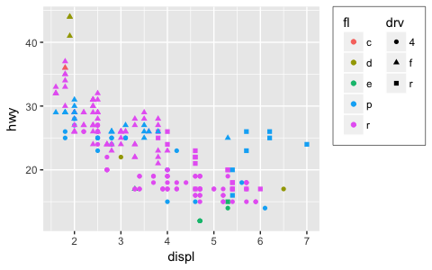
- Control of legend styling has been improved. The whole legend area can be aligned with the plot area and a box can be drawn around all legends:
ggplot(mpg, aes(displ, hwy, shape = drv, colour = fl)) +
  geom_point() +
  theme(
    legend.justification = "top",
    legend.box = "horizontal",
    legend.box.margin = margin(3, 3, 3, 3, "mm"),
    legend.margin = margin(),
    legend.box.background = element_rect(colour = "grey50")
  )
-
panel.marginandlegend.marginhave been renamed topanel.spacingandlegend.spacingrespectively, as this better indicates their roles. A newlegend.marginactually controls the margin around each legend. -
When computing the height of titles, ggplot2 now inclues the height of the descenders (i.e. the bits
gandythat hang underneath). This improves the margins around titles, particularly the y axis label. I have also very slightly increased the inner margins of axis titles, and removed the outer margins. -
The default themes has been tweaked by Jean-Olivier Irisson making them better match
theme_grey().
Stacking bars#
position_stack() and position_fill() now stack values in the reverse order of the grouping, which makes the default stack order match the legend.
avg_price <- diamonds %>%
  group_by(cut, color) %>%
  summarise(price = mean(price)) %>%
  ungroup() %>%
  mutate(price_rel = price - mean(price))

ggplot(avg_price) +
  geom_col(aes(x = cut, y = price, fill = color))
(Note also the new geom_col() which is short-hand for geom_bar(stat = "identity"), contributed by Bob Rudis.)
If you want to stack in the opposite order, try
forcats::fct_rev()
:
ggplot(avg_price) +
  geom_col(aes(x = cut, y = price, fill = fct_rev(color)))
Additionally, you can now stack negative values:
ggplot(avg_price) +
  geom_col(aes(x = cut, y = price_rel, fill = color))
The overall ordering cannot necessarily be matched in the presence of negative values, but the ordering on either side of the x-axis will match.
Labels can also be stacked, but the default position is suboptimal:
series <- data.frame(
  time = c(rep(1, 4),rep(2, 4), rep(3, 4), rep(4, 4)),
  type = rep(c('a', 'b', 'c', 'd'), 4),
  value = rpois(16, 10)
)

ggplot(series, aes(time, value, group = type)) +
  geom_area(aes(fill = type)) +
  geom_text(aes(label = type), position = "stack")
You can improve the position with the vjust parameter. A vjust of 0.5 will center the labels inside the corresponding area:
ggplot(series, aes(time, value, group = type)) +
  geom_area(aes(fill = type)) +
  geom_text(aes(label = type), position = position_stack(vjust = 0.5))